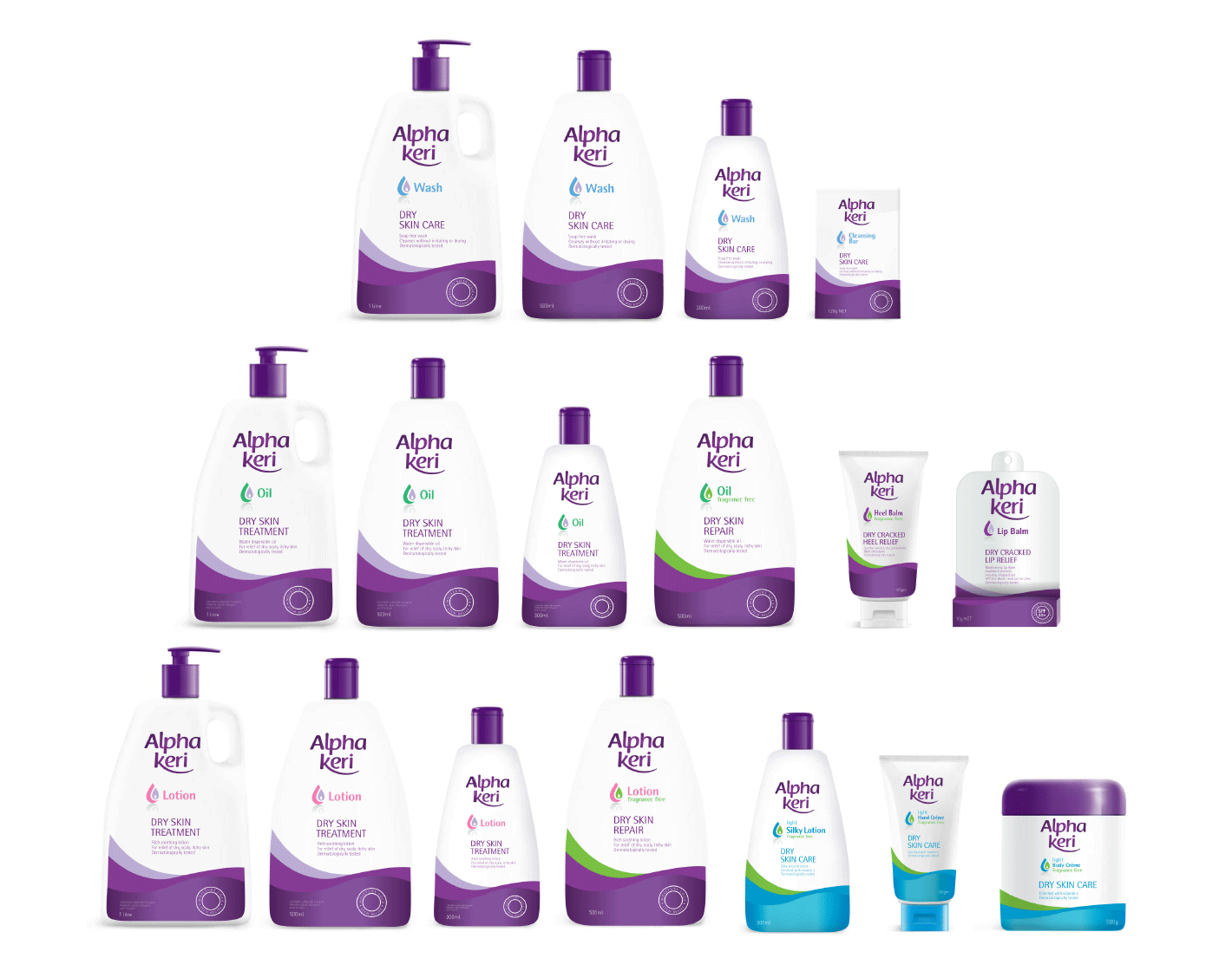
Alpha Keri Skin Care
Alpha Keri Skin Care is a pharmaceutical skin range. The product is excellent but looked very clinical and had minimum cosmetic cues on the packaging. Unlike some of their competitors who had beautified their range so customers were happy to buy and display in their bathrooms. The navigation between each product needed clarity and a new brand architecture was developed to make the offer clear. The colour purple was to be maintained as the key brand assets with a fresh brand identity. Minimal change with the lids and bottle shape to transition the range to market quickly.
Project: Brand identity, brand architecture, packaging structure research and pack designs.


No Comments